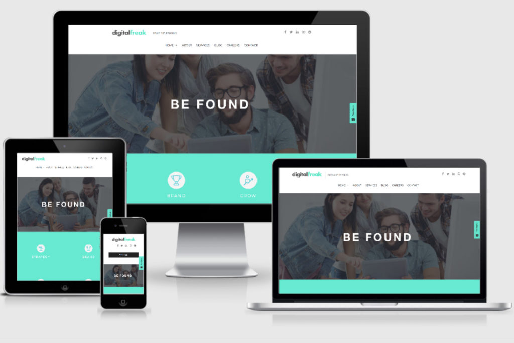
What are you reading this article on? Your phone? Tablet? Laptop? A giant iMac? Whatever the screen size, we hope your experience of our website is flawless. That’s because we’ve worked hard on the responsive aspects of Digital Freak. In today’s world, you can’t afford to deliver anything but a perfect user experience to all website visitors, whatever device they are using to explore your website.
Responsive design is the practice of creating a webpage that responds to a user’s behaviour and environment in terms of screen size, platform and orientation.
Due to their rapid increase in popularity, mobile phones and tablets are now the primary method of accessing the web. Mobile traffic alone is 52% of all web traffic in 2019! With so many people using their smartphones and tablets rather than desktop computers, it is paramount that your website looks and acts great, regardless of screen size. Responsive design should be integrated into every web development strategy because it will ensure your website runs smoothly across all devices.
Preferred for SEO
Search engines such as Google prefer websites which are responsive. A slow or unresponsive page can be frustrating for a user and Google knows this. When the search engines crawl your site and identifies it as user unfriendly on specific devices, it will lower your rankings. Most users will not put up with a slow or awkward page and Google doesn’t want to deliver poor results. Therefore, it gives higher priority to websites which are optimised for all devices.
Fast user experience
At the end of the day, we all want our websites to deliver a great user experience. Why? Because we know that a great website is more likely to hold people’s attention, convert visitors to customers and improve our overall online presence. Remember, people are prepared to look elsewhere if they can’t access your website properly via their phone, tablet or laptop.
Part of a responsive design is making sure that the website loads quickly on all devices. Websites which are slow to load annoy users, plain and simple. This is particularly relevant to mobile users. When you’re browsing the net on your mobile, you probably want something quickly and easily. A slow website is a big turn off and when the loading time is longer than a couple of seconds, the back button is clicked.
We predict that everyone reading this article has clicked back, away from a website which was slow to load. This contributes to a higher bounce rate. A ‘bounce’ is a visitor who landed on your website and clicked away without doing anything. This also includes people who clicked but didn’t wait for the page to fully load before clicking ‘back’. They bounced! Google doesn’t like bounces. Bounces imply your website content is not valuable/relevant (with a few exceptions, such as contact pages!). Lowering your bounce rate is vital for SEO but it is also something you should be aiming to do simply because you want your website to be engaging visitors. The best way to make a good first impression and minimise bounce rates? Load fast on any device.
Increased conversion rates
Have you ever given up filling in a form because it just wasn’t working properly? Hidden buttons, too many fields, awkward password requirements. There are many reasons people may abandon a form or a purchase online, particularly on a mobile. Remember to test your forms on a desktop, laptop, tablet and mobile, ensuring the experience is simple and smooth for all users, whatever they are using. This is a great way to minimise abandoned carts and maximise the number of enquiries.
Affordable
Some businesses have 2 websites running – one for mobiles and one for desktops.This can be costly for business – they have to pay maintenance and hosting twice, SEO twice and all of this affects ROI. A responsive design means you only have to pay once, only have one website to update content on and only have to deal with maintaining one website. We know how important it is to streamline and simplify the effort of maintaining and optimising your digital presence.
If you’re not sure about whether your website is responsive, get in touch with Digital Freak today and we’ll check it out for you. If we find some issues, we’ll let you know and can even quote to fix them up for you!

You know how they say content is King? Well, meet the Queen. Engaging and exciting content is what I’m here to create. Whether it’s websites, print, digital, or social graphics – I take your brand’s vision and industry trends and turn them into high-quality content.