

The world of SEO and digital marketing moves fast. And it’s not alone. Technological advances over the past decade have been phenomenal. We have moved from a world where most Internet activity was conducted on desktops to society dominated by mobile phones, tablets and laptops. Whether you’re an Apple lover or an Android fan, chances are you use your smartphone to surf the net as well as checking your social media profiles every day. This has been the norm for a few years now so it’s no surprise that search engine algorithms are starting to mirror this behavior.
As early as 2015, Google announced that it was taking a website’s mobile-friendliness into account when it came to ranking pages.It’s no coincidence that this was the same year mobile search queries outnumbered desktop searches. In recent months, however, the SEO community have noticed that design and development for mobile devices is more important than ever before. Read on to discover why this change has happened and what you can do to improve your website.
Why does It Matter?
A key indicator for search engines such as Google when they’re trying to understand the value of a website is how long a user spends looking around. A site which delivers a poor user experience (UX) is likely to be losing web traffic and generate a high bounce rate. Slow load times and poor quality of information are common reasons for bounce rates. Often, developers created a mobile version of a website with limited information and stymied features. This will no longer work because Google is beginning to roll out a mobile-first search index, a big shift in the SEO community. That means the mobile version of your website needs to be just as good, if not better, than your desktop version if you want to stand out and get found online.
Introducing AMP
Not much of a tech person? Don’t worry, we’ll let you in on a little secret our web developers like to deploy for our clients: the Accelerated Mobile Pages plugin. An easy and free addition to your WordPress site, the AMP creates an open-source format load for your site in a virtual instant. No more waiting for pages to load and then disappointment when the page is impossible to use on a small device! In fact, the AMP Project is not only looking at improving UX on mobile devices but across all screen sizes. This is important because Google announced in January 2018 that they are taking page speed into account when it comes to ranking search results on mobiles. If you can make sure your website loads quickly on all devices, you’re guaranteed a boost in SERP placements.
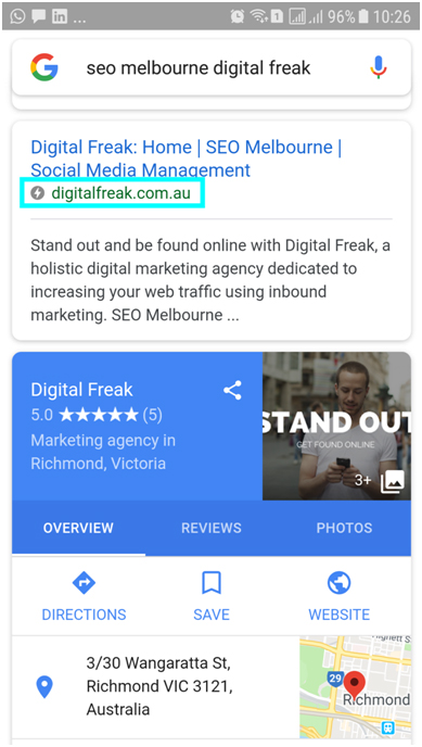
Figure 1: Proof Digital Freak Is Lightening Quick!
What’s The Difference?
Don’t assume that the only difference between a mobile searcher and a desktop searcher is screen size. Studies show that people using their smartphones to conduct web-searches come into the experience with different expectations. They’re likely to be out and about, looking for a specific piece of information which will help them continue their day/conversation/journey. Therefore, they are far more impatient (or goal-directed) and will not waste their time on a slow or cluttered website. When it comes to mobile devices simple, smooth and speedy are three keywords to keep in mind.
Standard Isn’t Enough
Most easy build website designers such as Wix, Weebly and Squarespace automatically create a mobile-friendly version of the desktop you put together. But ‘friendly’ isn’t enough any more. We’ve moved into a different realm where your website can no longer be acquaintances with mobile devices. Instead, they have to be best friends, completely committed tobeing there for one another in the good times (smooth page loading) and the bad (buffering or partially loaded pages). Except, with AMP, there are no more bad times; it’s smooth surfing from here on out! Even Responsive Web Design, revolutionary when it was developed, is not always enough to deliver the perfect UX on a smartphone. If you want to keep up with the world of SEO, you need to move beyond standard practices.
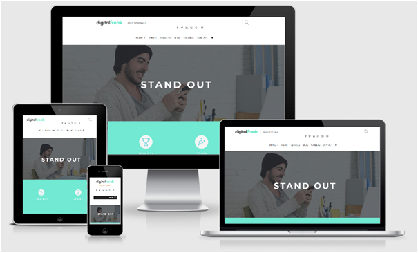
Figure 2: Responsive On All Screen Sizes – A Good Start, But Not Enough For Our Freaks
Is My Site Mobile-Friendly?
First things first, log into your Google Search Console account and check out your Mobile Usability Report. You can also use Google’s Mobile-Friendly Test Tool. This will give you a general idea of how your site performs for mobile users. From here, you can identify which areas you need to improve.
Overwhelmed? Don’t worry, we didn’t write this article to be purely informative (although we hope it has been useful to you). Digital Freak has a team of web developers, some of whom specialise in mobile and tablet website development. Why not get in touch today and we’ll provide you with a complimentary review of your website on desktop, tablet and mobile devices?

You know how they say content is King? Well, meet the Queen. Engaging and exciting content is what I’m here to create. Whether it’s websites, print, digital, or social graphics – I take your brand’s vision and industry trends and turn them into high-quality content.